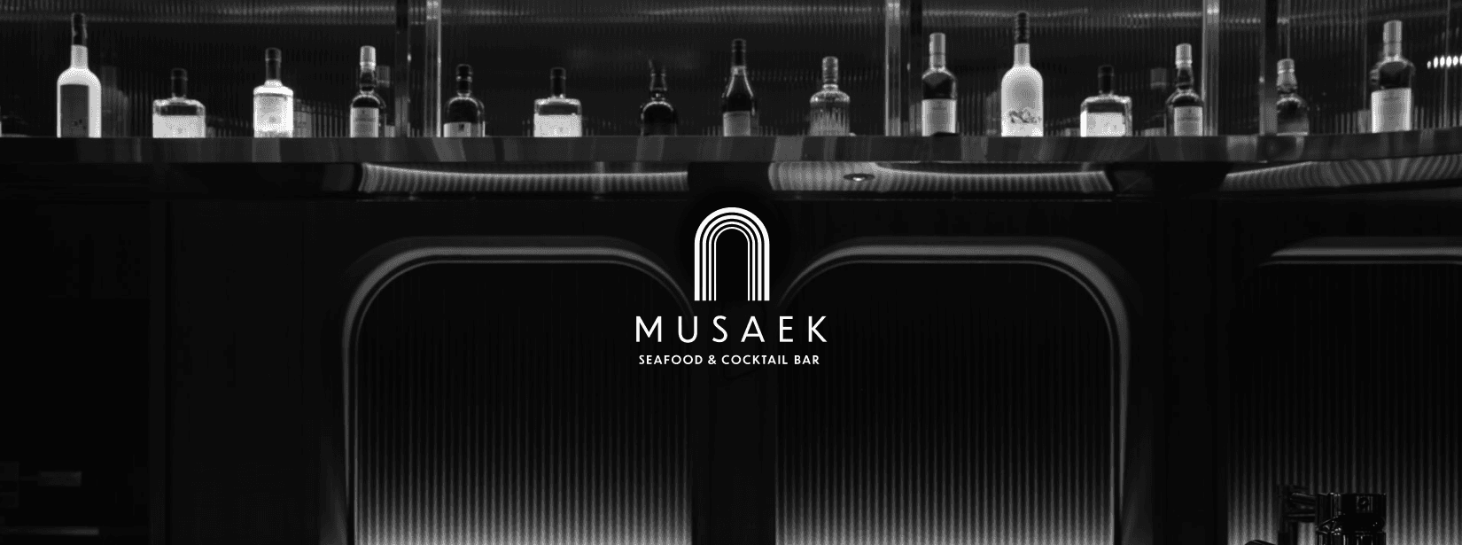


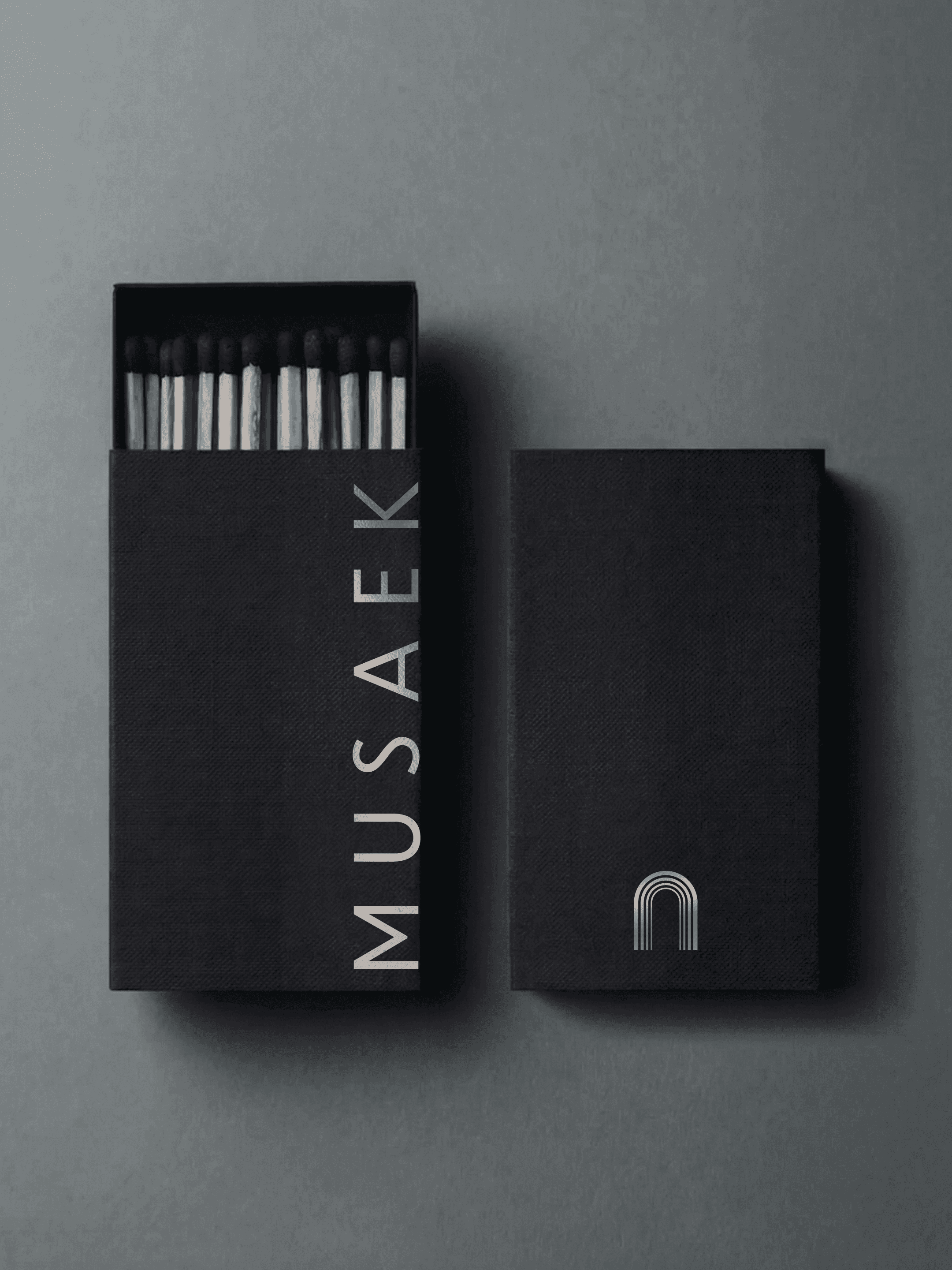

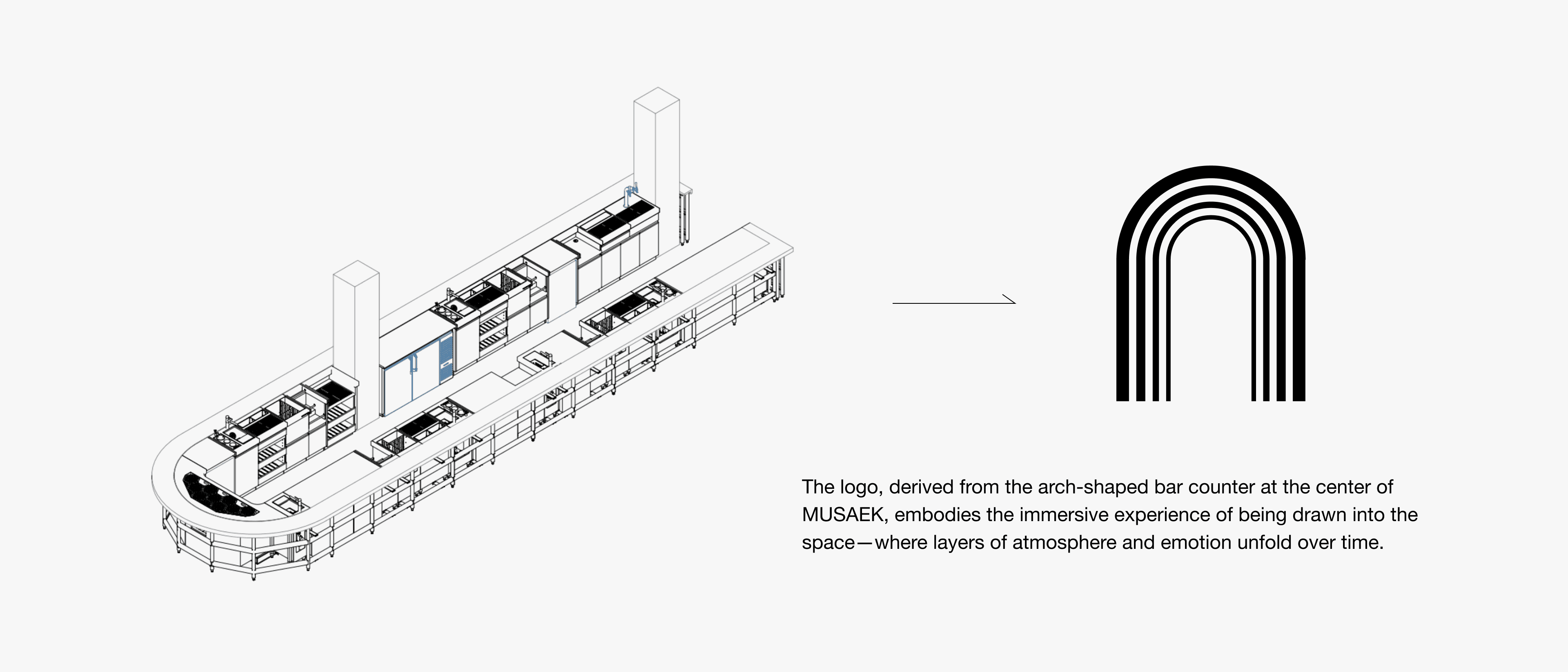

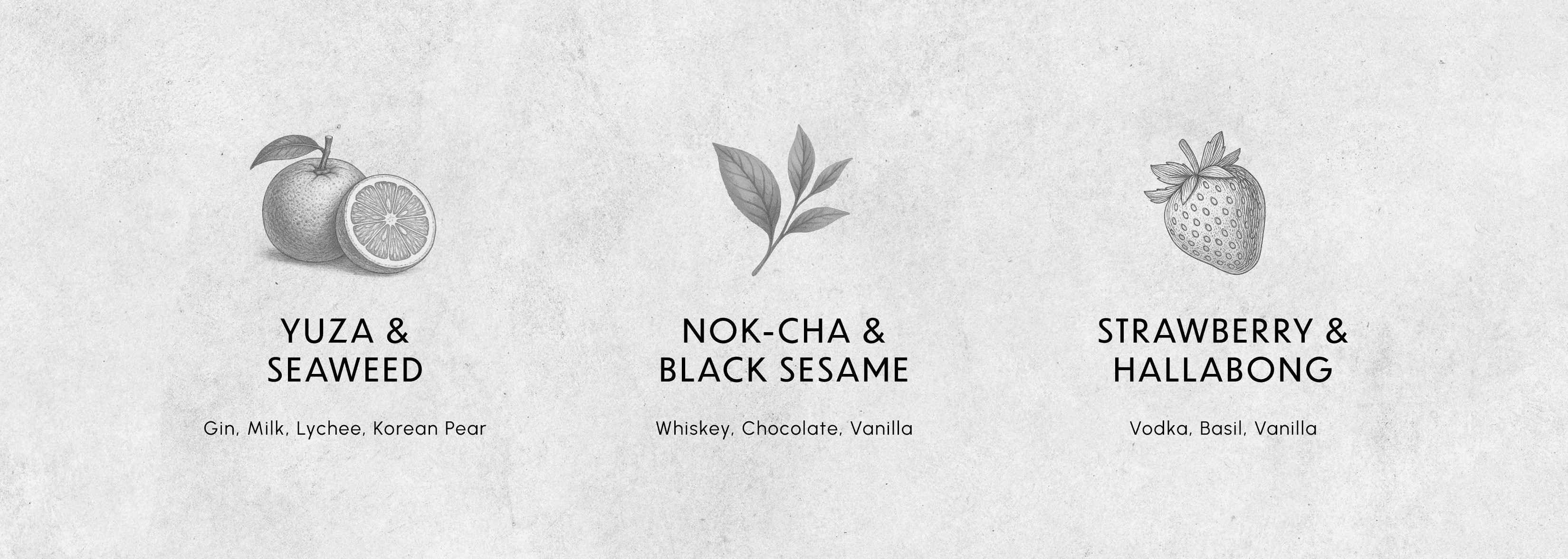
MUSAEK
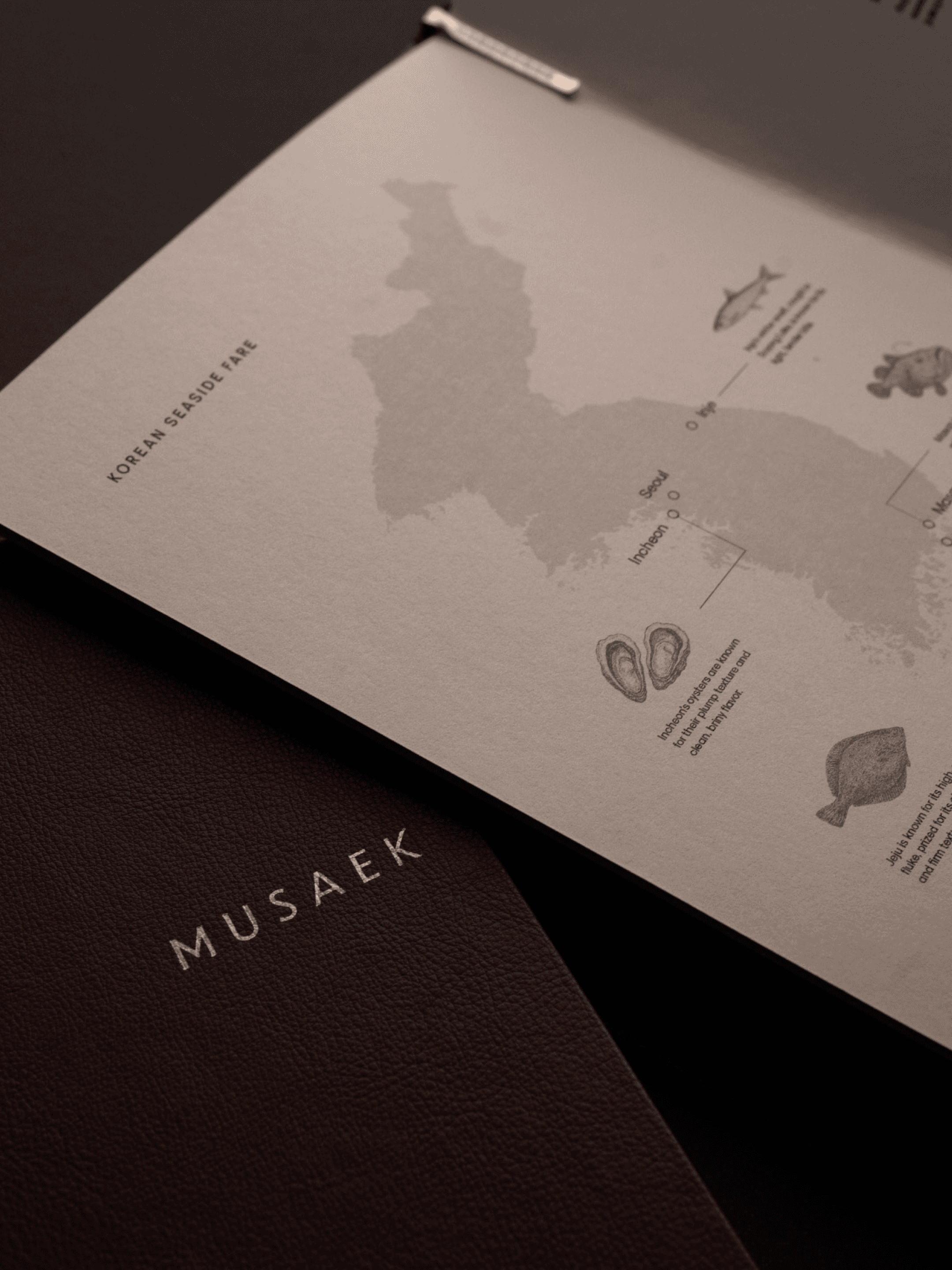
MUSAEK is a Korean seafood & cocktail bar in New York. The goal was to craft a visual language that embodies clarity and depth—where Korean tradition meets modern refinement.
Inspired by its name meaning “colorless,” MUSAEK expresses the coexistence of contrasts through calm minimalism and subtle detail. I led the branding and marketing direction across logo, menu design, and digital presence.
Category
Hospitality Branding
Company
KTM GROUP / Urimat Hospitality
Role
Brand Design & Marketing
Date
2025-2026
MUSAEK
MUSAEK is a Korean seafood & cocktail bar in New York. The goal was to craft a visual language that embodies clarity and depth—where Korean tradition meets modern refinement.
Inspired by its name meaning “colorless,” MUSAEK expresses the coexistence of contrasts through calm minimalism and subtle detail. I led the branding and marketing direction across logo, menu design, and digital presence.
Category
Hospitality Branding
Company
KTM GROUP / Urimat Hospitality
Role
Brand Design & Marketing
Date
2025-2026